
For the past year, I have been working, in an advisory capacity, as part of a team developing a local EJ map for Philadelphia. From the beginning, it was important to me that we not just reproduce the plethora of existing maps which show disparities across neighborhoods in environmental quality (e.g. heat index or air pollution), which while highlighting injustices, tend not to lead to any serious action to mitigate, let alone remediate them. Instead I am interested in mapping for self-determination.
In a previous essay, I defined resilience as the ability and extent to which we can thrive under precarious conditions, to endure stressors and recover from shocks. I also claimed that resilience requires community control and decision-making power — over land use, labor, resources, across the means and modes of production and exchange.
The work up to this point has mostly consisted of conversations with various environmental justice (or EJ-adjacent) organizations and everyday city residents, particularly in the most environmentally burdened neighborhoods, to understand their sense of the conditions in their own communities, which indicators of social and environmental health we might prioritize in a mapping tool, how such a tool might advance their work across a variety of use-cases, and how the functionality of the tool can be more conducive to its actual use, given the tendency of GIS maps to be arcane and inaccessible to non-specialists.
One of the overarching questions I’ve asked in my own independent research is “How can participatory methods be deployed toward the co-production of space?” In this essay, I propose how a GIS mapping tool might empower community members within a participatory decision-making and co-productive process, by correlating different land uses (e.g. urban agriculture, housing, industrial sites) with environmental impacts and various social determinants of health.
As the actual building of the tool is not my charge, nor is it within my skillset or capacity, what I want to attempt here is a kind of “proof of concept” wherein different environmental measures, such as Heat Exposure Index, Litter Index, Neighborhood Food Access, and Tree Canopy might be combined using a basic algorithm to standardize and weight each metric, and create a composite “Thriving Score”.
Heat Vulnerability

The first constituent metric of the Thriving Score is the heat vulnerability index (HVI), which considers variables such as surface temperature and reflectivity (as affected by impervious surfaces and asphalt roofs), building density and vegetation, against various social determinants of health such as race, age, and disability. The index ranges from -10 to +10, with negative values representing the least vulnerability, and higher numbers representing the most (Figure 1).
In order to bring these values into a relationship with the other metrics, I standardized the HVI using a simple formula to plot the values on 1 to 100 scale, and also reverses the values semantically, such that -10 (low heat vulnerability) equates to 100 (high heat resilience) and +10 to 1 (lowest heat resilience):
100 – (((“HVI” + 10) * 99) / 20)
For example, a block group with an HVI of -6.5 would yield a heat resilience score of 18.33. I then took the average heat resilience score for all block groups within each planning district in order to generate a comprehensive heat resilience score by district (Figure 2)

Neighborhood Food Access
There were many ways to measure “food access”, but for this metric I chose the percentage of stores with a high produce supply (HPSS) walkable within half a mile of each block group (Figure 3), creating a map informed by the city’s open data project.

As with heat vulnerability, I needed to standardize HPSS on a 1-100 scale, and so I used the following formula:
100 – (((“HPSS” – 0) * 99) / 50)
Here I set 50% of nearby stores with high produce supply as a feasible ideal. As with HVI, I took the average score for every block group in each district to calculate a composite “food resilience score” (Figure 4).

Tree Canopy
Meaningfully calculating tree canopy proved difficult, due to the quality, age, and usability of the data from the city. There were multiple kinds of data, from the locations of street trees — which proved inadequate for the fact that it did not consider the many trees on private property, or whole forests as in Fairmount Park and Wissahickon. In the end I chose data which displayed the “outlines” of tree canopy throughout the city, mostly as a visual representation (Figure 5).
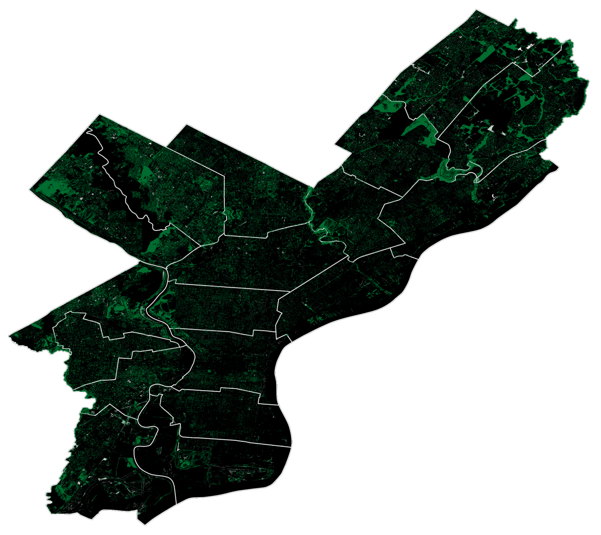
I then roughly estimated the area (in square meters) of each canopy by considering the relationship between height and crown spread. Research indicates that the relationship varies by species and can range from 0.5 to 0.7 times, but for the sake of time, I ignored this variation and split the difference, using 0.6 as the height multiplier. I then calculated “canopy density” as a percentage of the total area of each district occupied by canopy. Because these values were very low, I used a formula to standardize a “canopy score” on a scale from 1 to 100, setting 5% coverage as the ideal.
100 – (((“canopy density” – 5) * 99) / 5)
To check my work I mapped these results against the actual distribution of trees in the original shape file to ensure that those districts visibly containing more canopy did in fact also have the higher canopy scores (Figure 6)

Litter Index
The city also maintains a “litter index”, started back in 2018 under the now defunct Zero Waste Cabinet, and maintained up through 2023. Countless volunteers were deployed to observe and photograph litter, block by block, and evaluate it on a scale from 1 (no litter or very light) to 4 (extreme or heavy litter of the sort that cannot be removed without special equipment). See Figure 7 for a visualization of the litter index for the entire city, displayed block by block by red lines of increasing opacity as the scale moves from 1 to 4, minus those blocks which were not observed, which are displayed in yellow.
It is noticeable how the most severe litter burden is concentrated in the northern and southwestern parts of the city, consistent with patterns of disinvestment going all the way back to the time of redlining. Center City on the other hand, which sees much more foot traffic, and commerce, which would in theory lead to more litter, is on the whole cleaner, likely because these commercial corridors benefit from city services, deployed in service of “economic growth”.

As with the previous metrics, I needed to standardize the litter index, and so this time I took the median litter index value within each district (to account for the skew caused by significant variations across neighborhoods) and used the following formula to plot and invert these values on a 1-100 “cleanliness” scale.
100 – (((“litter_index” – 1) * 99) / 3)
The corresponding map shows the disparities by planning district (Figure 8).

Thriving Score
The “thriving score” is intended as a simplified way to understand the cumulative impacts of various environmental assets and burdens, each compounding and or subtracting from one another in various ways. The aforementioned four metrics — Heat Resilience Score, Food Resilience Score, Canopy Score, and Cleanliness Score — were each standardized and weighted differently in order to comprise a single comprehensive score, which was then mapped by district (Figure 9)
| THRIVING SCORE (Food Score * 0.3) + (Heat Score * 0.4) + (Canopy Score * 0.2) + (Litter Score * 0.1) |

Limitations
The limitations of this model are 1) that the constituent metrics were chosen more or less arbitrarily, and do not come close to representing the wide range of assets and burdens that affect quality of life in Philadelphia, and 2) the weights of each metric were also chosen somewhat arbitrarily, and any change in those values significantly changes the overall score.
For a true implementation, there would be a wider range of indicators, as identified through a participatory process. Likewise, the weighting would draw upon the lived experiences and priorities of residents, while also considering research into the compounding effects of different metrics, such as heat and tree canopy, themselves having impacts on other variables as well as an inversely proportional relationship on each other.
Results
In calculating the thriving scores of the 18 planning districts, clear patterns emerge of inequality and disparities in quality of life, reflecting the realities described at the start of the paper. Yet backing up those claims with data is redundant to people for whom these realities are self-evident. Mapping inequality has become a hackneyed exercise taken up by academic and state actors, with the stated intention of directing additional resources or implementing better policy toward alleviation of various environmental burdens, an outcome which has yet to be seen anywhere in the country, let alone Philadelphia.
I have described a “thriving score”, which may seem to be in contradiction to my earlier definition of resilience as implying some measure of community control. So my interest here is not to find yet another way to represent, visually or with data, that certain neighborhoods suffer undue social, economic, and environmental burdens, but rather to use mapping as a way for communities to strongly advocate for themselves. By this I do not mean appeals to the state, which often go unheeded, but to enable people to organize in their own defense, to participate in processes of co-production at multiple scales.
It is my hope that forthcoming environmental justice mapping tools will provide people with a granular way to look at data, understand the correlations between various burdens and their impacts on quality of life, and then to make decisions — about development, about siting, about relationships between people and land — that improve their quality of life. In my view, it is to what extent a community can materially transform their lived conditions that informs “resilience”.
So while the above sections indicate a correspondence between burdens and resilience, there is in fact a more important, and direct relationship between environmental burdens and people’s current inability to decide how their social and environmental worlds are developed. It is not merely the burdens that must be shifted and alleviated, but the power of people that must be elevated.
Discussion
Based on the relationship between different land uses and the thriving score, residents could make informed choices about which kinds of development they wish to support, not to mention how they might themselves engage in a process of participatory co-production. If we look at thriving scores against the distribution of different land uses across planning districts, we may very well be able to trace a pattern which could inform resident participation in future development. To do so I charted what percentage of the land area in each district was comprised by the eight city-categorized land uses, which also directly correspond to Philadelphia’s zoning regime.
| Residential (%RES) Commercial (%COM) Industrial (%IND) Civic / Institutional (%INST) | Cultural / Recreation (%CULT) Parks / Open Space (%PARK) Water (%WTR) Vacant (%VAC) |
| District | Score | %RES | %COM | %IND | %INST | %CULT | %PARK | %WTR | %VAC |
|---|---|---|---|---|---|---|---|---|---|
| Lower Northwest | 64 | 33.82 | 3.09 | 7.1 | 4.82 | 4.41 | 25.68 | 2.7 | 4.29 |
| Central | 59 | 24.13 | 10.94 | 3.08 | 5.14 | 5.09 | 4.30 | 10.99 | 2.22 |
| Lower Far Northeast | 57 | 29.98 | 7.74 | 13.36 | 5.47 | 6.63 | 6.86 | 0.33 | 2.79 |
| Upper Far Northeast | 53 | 43.31 | 7.26 | 9.3 | 5.26 | 4.74 | 2.23 | 0.11 | 7.97 |
| Upper Northwest | 52 | 47.98 | 2.74 | 1.04 | 8.16 | 3.13 | 14.37 | 0.52 | 2.89 |
| Central Northeast | 50 | 38.65 | 4.58 | 1.00 | 5.61 | 2.16 | 22.99 | 1.30 | 1.56 |
| South | 47 | 28.99 | 9.81 | 9.49 | 3.3 | 2.75 | 1.71 | 7.17 | 2.23 |
| North Delaware | 46 | 28.48 | 4.29 | 14.14 | 5.77 | 4.89 | 4.5 | 13.21 | 1.65 |
| River Wards | 44 | 16.38 | 5.67 | 22.94 | 1.84 | 0.99 | 2.33 | 15.62 | 6.08 |
| University Southwest | 44 | 27.43 | 4.08 | 2.63 | 10.32 | 4.43 | 7.83 | 3.62 | 5.13 |
| West Park | 43 | 21.49 | 3.2 | 4.38 | 4.02 | 12.63 | 29.3 | 3.69 | 1.32 |
| Lower South | 42 | 2.81 | 2.46 | 14.63 | 0.14 | 7.64 | 1.51 | 20.47 | 23.54 |
| Lower Northeast | 39 | 35.26 | 7.32 | 10.27 | 5.19 | 3.96 | 7.35 | 0.36 | 3.28 |
| Upper North | 37 | 43.62 | 4.36 | 2.35 | 7.13 | 2.28 | 6.99 | 0.08 | 2.34 |
| Lower North | 34 | 26.4 | 4.52 | 4.64 | 7.2 | 5.04 | 9.46 | 2.14 | 9.89 |
| West | 34 | 44.13 | 5.69 | 1.35 | 5.17 | 4.1 | 0.56 | 0.03 | 4.55 |
| Lower Southwest | 32 | 10.08 | 5.36 | 25 | 2.23 | 1.65 | 5.71 | 10.92 | 8.32 |
| North | 31 | 23 | 6.4 | 14.38 | 5.9 | 4.4 | 5.67 | 0.36 | 7.04 |
| Philadelphia | 45 | 29.19 | 5.44 | 9.67 | 5.04 | 4.47 | 9.04 | 5.3 | 5.52 |
Correlations between Land Use, Burdens, and Assets
As we look more closely at land use and environmental burdens (Table 2), and within that the possibility for such data to inform participatory development decisions, I will admit in advance to playing a bit loose with the correlations. More research is needed to draw specific and conclusive parallels, but there are at least some stories we can begin to tell.
Looking at the top and bottom three districts by thriving score, there are some potential patterns to observe across the data. For example, the Lower Northwest has both the lowest heat vulnerability index (HVI) and highest tree canopy density, each by some distance, and accordingly it comes as little surprise that it also has the highest allocation of park land of the districts shown here.
West Park, as the name suggests, actually has the highest amount of park land, with close to half of its land area occupied. Somewhat surprising is that Lower Northwest also has a very low commercial allocation, yet one of the highest percentages of high produce supply stores. This suggests that although the number of stores are fewer, their quality is, on the whole, significantly greater.
| District | Score | Canopy Density | Litter Index | Median HVI | HPSS% | %RES | %COM | %IND | %PARK | %VAC |
|---|---|---|---|---|---|---|---|---|---|---|
| Lower Northwest | 64 | 2.47% | 2.21 | -6 | 20.31 | 33.82 | 3.09 | 7.1 | 25.68 | 4.29 |
| Central | 59 | 1.21% | 1.48 | -4.87 | 20.04 | 24.13 | 10.94 | 3.08 | 4.30 | 2.22 |
| Lower Far Northeast | 57 | 1.35% | 1.3 | -4.78 | 14.6 | 29.98 | 7.74 | 13.36 | 6.86 | 2.79 |
| Lower North | 34 | 0.99% | 2.27 | 4.4 | 9.17 | 26.4 | 4.52 | 4.64 | 9.46 | 9.89 |
| Lower Southwest | 32 | 0.54% | 1.94 | 3.45 | 6.58 | 10.08 | 5.36 | 25 | 5.71 | 8.32 |
| North | 31 | 0.66% | 2.21 | 4.26 | 6.72 | 23 | 6.4 | 14.38 | 5.67 | 7.04 |
Central district (Center City) also has a rather high produce supply, a fact which, contrary to Lower Northwest, likely correlates to the high percentage of commercial land uses. As is common in many cities, center city Philadelphia is more of a commercial hub than a residential or industrial area, and so while there are also plenty of low (or no) produce stores in the area, the sheer number of overall stores increases the number of those which carry high produce supplies, even as the proportion is lower.
Lower Far Northeast has middling values across the board, but strong enough in the aggregate to place third of eighteen districts in terms of thriving score. Although there is a relatively high allocation of industrial land uses, the median HVI remains low, a relationship which can perhaps be explained by the overall greater land mass, which at 11 square miles is the largest in the city. Although it has higher park allocations than many districts, its canopy density is low due to those trees being more spread out across a larger area. The same may be true for the impact of its relatively high proportion of industrial sites, their burden more widely distributed.
The Lower North district, which is about half the area of the Lower Far Northeast, has higher park allocation, yet lower canopy density, which at first glance seems contradictory, until one realizes that the vast majority of that allocation is comprised by East Fairmount Park on the far west side of the district, something of an oasis in an otherwise tree-scarce landscape.

One important exception is the North Philadelphia Peace Park, located in the Sharswood neighborhood, notable for the fact that it came into being, and has continued to be sustained through the hard work and self-determination of people in the community, even in the face of state violence.
The Lower Southwest district stands out as one at the intersection of multiple severe environmental burdens, undoubtedly related to its industrial history. The district has one of the lowest allocations of residential land uses at around 10% against the city’s 30%, and a full quarter of its land use being industrial — the bulk of that made up by the former oil refinery. The uneven development in this district, and low residency, likely accounts for both the low tree canopy and lack of high produce supply stores.
The closing of the refinery and its contested redevelopment by organizations such as Philly Thrive, is precisely the kind of use case that a good mapping tool could serve, if correlations can be drawn between the high industrial use and the preponderance of environmental impacts. Correlations which have already in fact been made by community members and activists, only to mostly go ignored by those in power. If only land use could be the frame within which people organize for direct decision-making, as opposed to appeals to the state.
Finally, we have the North district, with the lowest overall thriving score in the city, encompassing several highly burdened neighborhoods. Nicetown has a disproportionate amount of industrial siting, including both the Midvale Septa bus depot and a natural gas plant, while Hunting Park, contrary to its name, has some of the lowest tree canopy of all neighborhoods. This fact which triggered a wider public awakening around the heat island effect and the neighborhood’s 22 degree temperature disparity with Chestnut Hill in the upper northwest.
The high industrial development, and long industrial history likely account for the low tree canopy, high median HVI, and low supply of high produce. Planting new trees, as with the city’s “Beat the Heat Hunting Park” initiative, can make a difference, but it will take decades for the benefits to fully manifest. In the meantime, the fight against the gas plant in Nicetown continues, in spite of being hamstrung by the city’s (and SEPTA’s) refusal to seriously consider stopping its operations.
Where land use could be operationalized as a frame for organizing, there may be more rapid material changes that could take place while we wait for the trees to reach their full potential. It is worth noting that the three districts with the lowest thriving scores also have some of the highest distributions of vacant land, which represent both a history of divestment and potential opportunities for modeling participatory development.
Zooming in to the Hyperlocal
Planning districts can be a misleading frame in making meaningful assessments about people’s quality of life for multiple reasons: 1) They do not correspond to how people actually experience the city, whether in terms of identity, how they delineate the boundaries of their neighborhoods, or the span of where they live, work, play, and build community; 2) they do not align with council districts, which means that the residents of a planning district may have to appeal to different council members with different agendas and priorities; 3) they encompass large chunks of land which include very different neighborhoods, many of which are divided racially and economically. Inequities on the smaller scale can easily be obscured or skewed in either direction.
For example, Chestnut Hill is well-known as one of, if not the wealthiest and most prosperous neighborhood in the city, scoring high on every conceivable metric, from being clean and pristine, to its low heat vulnerability and high tree canopy, to widespread healthy food access, and ample access to parks and green space. Yet because the planning district also includes middling Mt. Airy, and the far more vulnerable neighborhood of Germantown, its overall score is lowered.
If we take a closer look at the constituent metrics within Germantown, separated from the larger Upper Northwest Planning district, we can see how they may correspond to land use (Figure 10).

The proliferation and uneven distribution of infrastructure throughout Germantown results in the creation of multiple microclimates: areas where temperature, air quality, and flood indexes vary significantly from the median for the neighborhood. Heat exposure considers variables such as surface temperature and reflectivity (as affected by impervious surfaces and asphalt roofs), building density and vegetation. As shown in Figure 11, Germantown’s hotter microclimates roughly correspond to the siting of commercial and industrial infrastructure, with the hottest areas being along the two perpendicular commercial corridors (Germantown and Chelten Avenues).

Germantown has a relatively low percentage of stores carrying fresh produce in nearly every block group, with the exception of those abutting the wealthier Wissahickon neighborhood (Figure 12). What this means, in practice, is that even where food stores are within an accessible distance, they are not likely to carry fresh produce. Juxtaposing this reality with the aforementioned indicators of poverty and heat vulnerability, one can start to sketch a narrative wherein low-income residents, who are more likely not to have access to their own transportation, either have to settle for lower quality food, or risk their health, especially during summer months, to travel further for fresh produce (Mayer et al 2014).

In a similar way, although Germantown, along with nearby Mount Airy and Chestnut Hill have higher than average tree canopy compared to the rest of the city, the different heights, spreads, and densities are not distributed evenly throughout the neighborhood, and as with heat exposure, correspond to commercial and industrial zones (Figure 13). Tree canopy has a direct affect on surface temperature and air quality, with trees mitigating both stressors through the process of envirotranspiration.

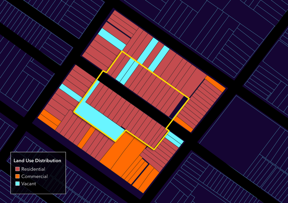
Zooming in even closer to a block group in the southeast of the neighborhood, we find a preponderance of vacant lots (Figure 14), which represent both the history of disinvestment, and a significant opportunity where residents were able to have direct decision-making power over how those parcels are developed.
There are 332 lots, together comprising 2.5 acres, which in principle is enough land for urban agriculture to provide for most of the nutritional needs of people within the block group, though logistically difficult for the fact of its discontinuity. However, equipped with a tool that allows people of the community to project changes in thriving score based on land use change, they could collectively negotiate for immediate material improvements in their quality of life.


Figure 14: Close-up of Block Group 245 in Germantown – left side shows the wide variety of existing land uses, while the right side highlights the excess of vacant lots
Important to note is that at the block scale, federal, state, and city designations break down, as people experience their blocks as those land uses and people who they see from their front steps (Figure 15). At this scale, because there are no city representatives, there is a possibility for self-organizing around land use. With a tool that allows people to project land use change and its impacts, they might collectively negotiate for immediate improvements.
Conclusion
Supporting or creating land uses such ad urban gardens, orchards, and farms would have likely impacts on food access, litter index, heat vulnerability, and eventually tree canopy, which itself would have a compounding effect. Placing requirements for sustainable building practices on new buildings, or affordability requirements on housing would further reduce vulnerability.
The ability to say no to a new chain convenience store, and with it an inevitable increase in food waste and litter, and instead give preference to local worker-owned cooperatives would promote both economic and environmental benefits. More obviously, the right of refusal on the siting of a natural gas plant — denied to the people of Nicetown, already environmentally burdened — would have enormous impacts on various health and quality of life outcomes.
As I’ve already posited in my earlier essay on the Building BLOCs model, resilience scales with the level of resident participation within land use decisions. Once again invoking Arnstein’s ladder of participation, there is a direct and inverse relationship between precarity and self-determination. A GIS mapping tool, where it allows residents to draw connections between land use and quality of life, could provide rich empirical background, context, and data to correlate with their lived experience.

The 5D Ecological Compass is one framework that could prove useful in establishing the conditions and practice of deep participation, as it situates residents in relationship to each other, and to their environment, and prompts them to think through questions of how those relationships might be transformed so as to promote higher standards of living.
In a future essay, I will discuss how design logics such as permaculture can be brought into conversation with the 5D ecocompass, so as to concretely develop a process of coproduction, one which scales from the block to the bioregion.